“I SEE YOUR POINT!” HOW DATA VISUALIZATION AND FACILITATING ACCESS TO DATA CAN HELP STAKEHOLDERS MAKE MORE IMPACTFUL DECISIONS
Imagine that you’re in charge of a geographical area (let’s say a state) for a period of time. During this time, a disease outbreak is predicted to happen. Your chief medical advisor tells you that the disease will kill 600 people if no action is taken. There are, however, two plans. Neither of which guarantee that you’ll get everyone out safely. In plan A, 200 people will be saved whereas in plan B there’s ⅓ of a chance that 600 people will be saved otherwise no one will be saved.
What plan will you choose?
Now let’s take the same situation except your chief medical advisor gives you the same plan in a different manner. This time you are told that Plan A means that 400 people will die and in Plan B there’s a ⅓ chance that no one will die, otherwise 600 people will die. Did this change your mind? If you’re anything like the respondents that Amos Tversky and Daniel Kahneman encountered in 1981 then you most likely chose Plan A in the first scenario and Plan B in the second scenario.
This experiment led Tversky and Kahneman to conclude that human beings respond differently to the same set of information depending on how it is presented to us - what is now known as the framing effect.
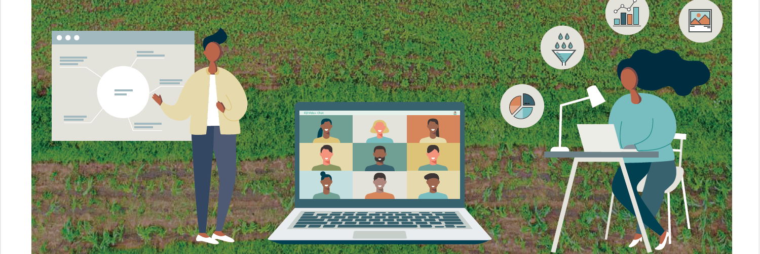
Evidence based and informed decision making is key for developing relevant and effective strategies and policies, and evidence is often drawn from big data. Many of the most useful data sets contain large amounts of valuable statistics which can be difficult to comprehend in a meaningful way. Data visualization turns complex numbers and other pieces of information into graphs, tables and charts, making the evidence easier to understand and use and enabling decision makers to grasp various concepts and get data-driven insights in order to make evidence-based decisions.
However, simply presenting people with designed data doesn’t mean good decisions will happen. As Tversky and Kahneman proved, how the data is presented plays a big role in how it will be understood. Data visualization can become a stumbling block to decision makers if not designed to communicate clearly and allow the user to further interrogate the data to reach a full understanding of what’s presented. Further, even when well designed, facilitation to guide accurate interpretation is vital. Who is helping the policymakers bring that evidence together, identify new patterns, and then use that synthesized information to make solid policy and strategies? Very little research has been done to understand the importance of facilitating interaction with data for uptake and use.
The opportunity to conduct research around both these areas presented itself in Kenya where decision makers and technical staff from multiple government sectors and non-governmental organizations at national and subnational levels were working on developing the Kenya National Agroforestry Strategy, with technical support from CIFOR-ICRAF. Together with the Busara Center for Behavioral Economics we set up at ICRAF’s SHARED Decision hub to seize the momentum.
Our study aims to address two key research questions.
- One on understanding data visualization preferences: What visualized formats do stakeholders, including technical officers find preferable and what meaning is derived from these different formats for understanding elements for agroforestry systems?
- The second on understanding the impact and influence of facilitation and peer learning: How do technical officers interact with economic, social and environmental data sources for problem solving, project design, and policy related decision making in facilitated and peer learning spaces?
The research started out in November 2020 and was carried out in 3 parts. First, an online survey was disseminated to determine their data visualization preferences. These initial results were used to refine the survey for wider application as well as part of the online workshops taking place the following month. Next, a set of virtual workshops(due to COVID) were carried out to understand the two research questions in greater depth. At the workshop, the morning session focused on data visualization without facilitation while the afternoon session focused on facilitation with SHARED guiding participants into deeper exploration of the data. This included an interactive ‘evidence wall’ to unpack and explain each of the data sets, their linkage and how the evidence can inform trends on woodfuel. Finally, they were asked to complete a post-workshop survey for researchers to understand the impact and influence of facilitation versus peer learning on their impressions of the workshop success, in addition to the outputs produced by each working group.
The results are still being analyzed, however, the data visualization survey results show that participants preferred the simpler data display options such as tables and bar charts to the more complex ridgeplots and boxplots. This result alone could already create obstacles to building awareness around integrated approaches and demonstrating the inter-relationships among different layers of data. The post workshop survey showed that, for the most part, facilitated workshops were more beneficial to data uptake and application by stakeholders, and could contribute to improved evidence-based policy development decisions.
This effort shows that future research is needed to unpack the nuances in the decision making process that may actually be a set of linked incentives, behaviors and patterns that are influenced by individual status, gender, background and position. In addition, practitioners need to work to understand the capacity of their targeted users as there’s likely to be a wide range of experience and knowledge levels that need to be catered for.
An old proverb states that the water pot breaks at the doorstep, pointing to how you could go through all the effort of walking to the river to collect a pot of water only for it to fall and shatter to pieces just as you get to your compound. As Tversky and Kahneman proved, all the work that goes into gathering the data needed for an evidence-based approach to policy and strategy development could be breaking at the proverbial doorstep – how we handle this information when presenting it to stakeholders. Stay tuned for our next blog on the full results and our work to develop a mobile app to be able to scale these tests, within different project and geographic contexts.
To learn more about this work, read this research brief.
Citation:
Mieke Bourne, Constance Neely, Christine Magaju, Christine Lamanna, Nathanial Peterson, Rosina Wanyama, Tor-G. Vågen, Sabrina Chesterman and Leigh Winoweicki. 2021. Enhancing policy and strategy planning. How to tailor data visualisation and evidence sharing for improved stakeholder uptake and application. Research brief. World Agroforestry. https://worldagroforestry.org/output/enhancing-policy-and-strategy-planning-how-tailor-data-visualisation-and-evidence-sharing
This work was supported by the CGIAR Research Program on Policies, Institutions, and Markets (PIM) as part of the research under Flagship 1: Technological Innovation and Sustainable Intensification.
More news from Flagship 1: Technological Innovation and Sustainable Intensification